Why merge requests are so useful and how to make them work
Door Jeroen Daanen / apr 2021 / 1 Min

Door Avisi / / 4 min

The goal of this blogpost is to give developers a heads-up on colour blindness and some simple steps on how to deal with it. If you’re already familiar with this and are looking for detailed research on colour blindness, this post is probably not for you.
According to the Colour Blind Awareness website, approximately 4.5% of the entire population is colour blind of which most are men. So the chance that a colour blind person uses your software is very, very big. Luckily there are a few easy steps that we can take to make sure that our interfaces work, even when some users don’t see (the right) colours.
To build interfaces with colour blind people in mind, we should first have an idea of what it means to be colour blind. I’m going to give a short overview with examples of common cases of colour blindness.
Some people think that the colour blind don’t see any colours at all. Although this can be the case, it’s very rare. Most colour blind users are less sensitive or completely insensitive to either red or green colours. Being insensitive for red colours is called Protanopia while being insensitive to green colours is called Deuteranopia.
Being insensitive to blue colours is very rare and is called Tritanopia. Not seeing any colours at all is even more rare and is called Achromatopsia. I’m going to focus on Protanopia and Deuteranopia for now as these are more common (but don’t worry, when you follow my tips later in the article, you’ll also be able to build software for people who suffer the less common types of colour blindness).
If you want to go into more detail or want to know the theory behind colour blindness, I recommend you to go to the Colour Blind Awareness website.
So what do these people see? When looking at a colour picker for example, they might see something like this:
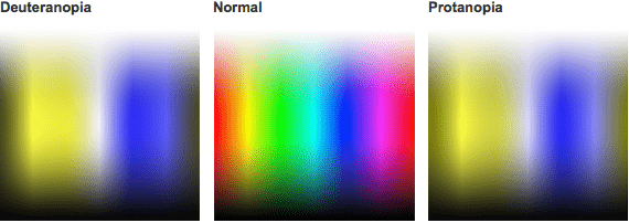
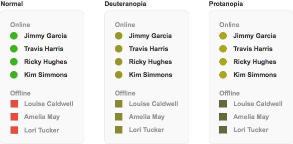
And to illustrate this effect in a real life example, here's a simple contact list:
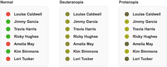
Looks like people with Deuteranopia will have a hard time in this example. Luckily, we can help them out!
The most important thing that you need to keep in mind is that you should not rely solely on colour to convey a message. It’s perfectly fine to use colours in a UI to emphasise a message, it makes most interfaces a lot easier to use. But always make sure that the colour is not the only visual cue for your user.
The contact list above is a great example of why some users might have trouble working with your software. While most users will see a clear separation between who's available (green) and who's not (red), colour blind users might have trouble distinguishing between the two.
Always make sure that the message is clear when (the right) colours can’t be perceived. We have several options to do this, for example by adding symbols, patterns or text:
Take the contact list from earlier for example. If we'd indicate the red status with another symbol, a square for example, it's a bit easier to see the differences when you don't see the colours.
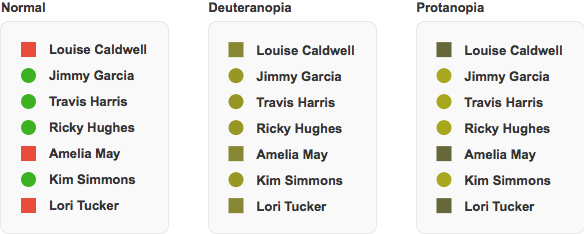
Symbols are great to use when you don't have a lot of space available for the element. Another great example for using symbols is Highcharts. Each line in the chart has a different colour, but also a different symbol for data points.
Another option is to add patterns to your UI elements. This usually works really well for elements with bigger areas of colour. Here's a quick and dirty example of this in action:
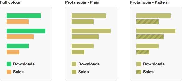
Sometimes text is the right option to choose. Not only does it make the interface more accessible to colour blind users, it also explains the meaning of the colour. Everyone benefits from this.
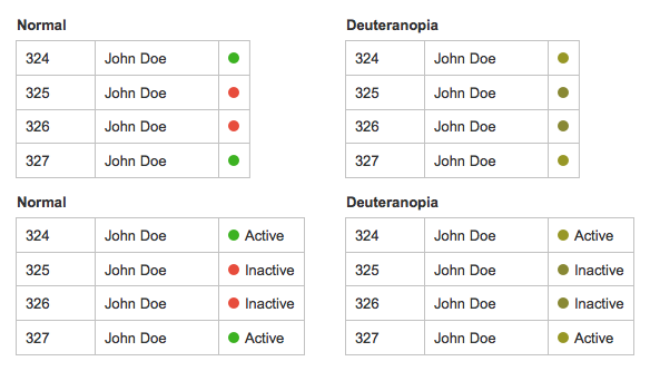
It's also possible to combine several techniques if that improves the usability of your interface. This is where you get to be creative! The contact list example from earlier could use text and icons:
There are several ways to test whether your interface is suitable for the colour blind and they don’t have to take long. In fact, there are ways to check your interface in matters of seconds.
There is a lot of emulation software out there that will help you look through the eyes of a colour blind person. Most software is free and has several settings so you can emulate all types of colour blindness, even the rare ones.
There are two apps that I currently use:
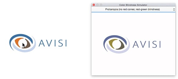
Sim Daltonism - Mac only. This app opens a window that shows a copy of the part of your screen your cursor is currently at. The upside to this is that you can easily click through your application and see the normal version and the colour blind version next to each other.
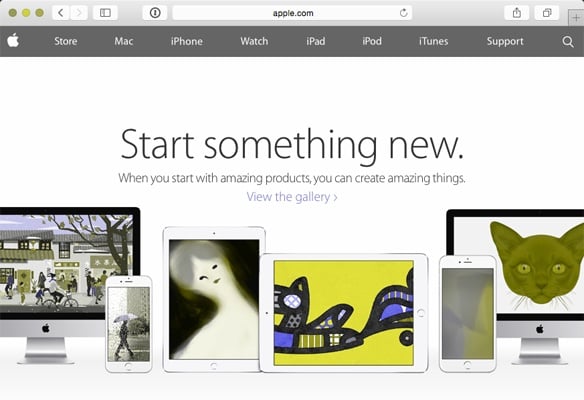
Colour Oracle - Windows, Linux, Mac. This app adds a filter to your whole screen that shows you what everything would look like to a colour-blind user. The upside to this is that you have a more contextual view of what’s going on. The downside is that you can’t click through your application with the filter, as this will remove it.
Another tactic I sometimes use is to just ask a colleague for his opinion. As one in twelve men is colour blind, chances are big that one of your colleagues is colour blind. Ask them to take a look at the interface and see if everything is clear to them. Don’t forget to ask them to perform some tasks or point out some parts you’re not sure about.
The Dash website we've been working on first showed hyperlinks in a blue colour and removed the default underlining that normal links have (mainly because it looks cool). One of our colleagues then noted that the links weren't standing out that much, so we investigated with one of the emulating apps.
This is what it looked like:

We also asked a colleague of whom we know he's colour blind and it turned out he was right, so we added underlining as an extra visual cue:

Another example with Dash, but this time the product itself. Dash is a wallboard that runs on a television in the office and keeps everyone updated on vital information. When everything is allright, Dash is supposed to stay in the background so it doesn't distract you. But when something is wrong, it'll stand out and call for your attention.
We choose a neutral blue/grey colour for elements that don't require any attention. But when a certain threshold is reached, the element goes into a warning state and becomes yellow. The difference between these two colours is big enough to be perceived by almost all colour blind users, even when they don't see any colour at all.
When another threshold is reached, the element goes into a critical state and becomes red. This change is obviously very important for our users, but the difference between yellow and red isn't as big for everyone. To accommodate colour-blind users, we did change not only the colour
but also added a background colour.
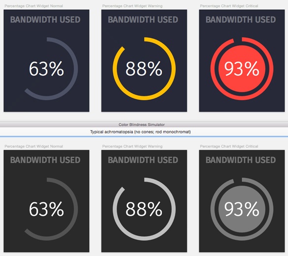
We're still testing out this feature and it might change or be improved in the future, but so far it looks like we'll accommodate most of our users.
If you would like to share your experiences, have any tips or questions, send me a tweet: @Muurtegel.

| Design
Door Avisi / okt 2024
Dan denken we dat dit ook wat voor jou is.